Over the past month, the Digital Person Data Protection Act, 2023 (the “Act”) has flooded everyone’s feed. Stepping away from the usual legalese, we’ve decided to look at the Act through the lens of user interface/ user experience.
The Act lays out the elements of valid notice and valid consent. It is important to time a notice correctly, as the timing can impact whether the user will pay attention to it or ignore it.
The problem statement is How do you:
- Clearly communicate the ‘what’ and ‘why’ of information collected?
- Get consent?
- Make your lawyers happy?
- Not ruin your slick interface with glaring warning signs?
An unenviable balancing act.
In the first paper in our series on UI/UX, we will be exploring potential designs to provide notice to users.
There are four types of notices, depending on their timing and design, which an app or website can use[1]. It is recommended that reliance is not placed on any one type of notice. Instead, all of them should be used to complement each other and incorporate privacy by design.
At setup: Notices can be provided when the app or website is being used for the first time. This enables the user to inspect, acquaint themselves with, and consent to data processing related practices before starting to use the app or website. At the same time, during setup, users may have difficulty making informed decisions because they have not used the app or the website yet and cannot fully assess its utility or weigh privacy trade-offs. Therefore, this should be complemented with other types of notices.
There are three different types of privacy notices that can be shown at setup, depending on their design. The long form privacy policy is the most used option of all. However, there are a variety of approaches to communicating the privacy policy other than the long form privacy policy, which may be better suited for a mobile app’s screen and touch interface. These are:
Short form privacy policy: These notices highlight only the essential elements of a valid notice. More granular disclosures are hyperlinked for ease of access. We would recommend this for websites/apps that collect limited information, such as names and contact information, for necessary communication.
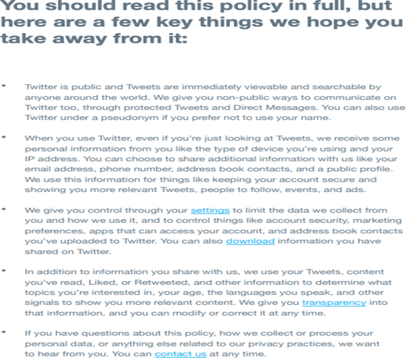
Example of short privacy policy notice for websites[2]
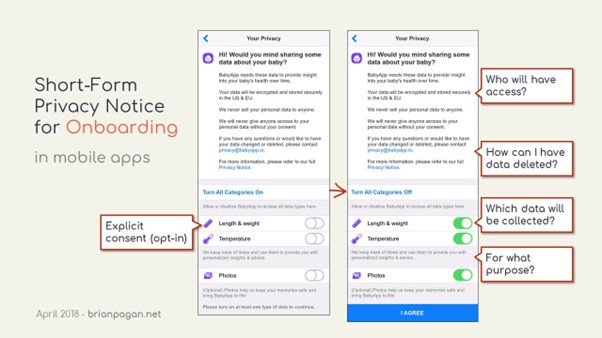
Example of a short privacy policy notice for websites[3]
Short form privacy notice for mobile apps[4]4
Layered privacy policy: This is a revised delivery mechanism of the usual long form privacy policies, which presents all information in a single notice on the screen. Layering a privacy notice is to create segments of the various elements of a valid notice which must be provided to the user. For instance, the first layer can be a short paragraph informing them how their data will be used, the second could be in a collapsible format containing information about processing and sharing, and the third layer can be link to the relevant section of a full privacy policy.8
Layered privacy notices allow users to navigate directly to the section of the notice that they wish to read, thereby breaking down a complex document and increasing user-friendliness. This approach is also suited for websites/apps that cater to multiple user ‘classes’, where user attention can be directed to relevant disclosures.
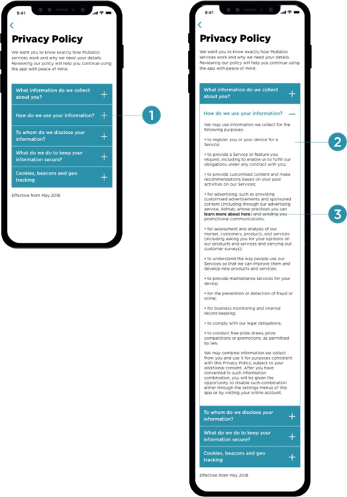
Example of layered privacy policy[5]
Just in time: Just-in-time privacy notices are used to provide specific contextual ‘privacy information’ as and when it is most relevant for the user. This method is useful for providing information at various points throughout the use of the app or the website. These are also known as pop-ups, or floating banners, however, these must not utilize auto-dismissing or expiring notices, pop-ups or banners.11
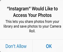
Example of just-in-time notice[6]
It helps to distribute information throughout the use of the app or website and reduces the reliance on the privacy policy shown at setup which may be difficult to understand out of context. Providing notices in a timely manner is a vital element of the transparency obligation a user, and help an organization demonstrate better compliance with the requirement of informed consent. For instance, in the case of mobile apps, access to information from functionalities such as camera, contacts, location tracking, motion sensors and facial ID (where applicable), microphone, messages, phone, photos, and social media accounts helps ensure that the consent is valid, specific, informed and meaningful.
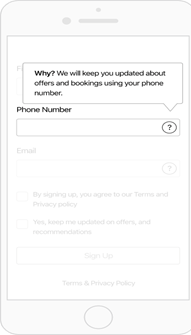
Example of Just in Time Hovering Notice[7]
There are two key design considerations that must be weighed for just-in time in-app permission requests which help a user navigate an application’s processing of her data with consent. These are: (a) timing of the request; and (b) information in the request.
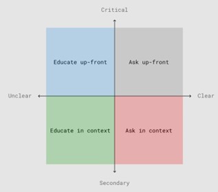
Design considerations for permission requesst[8]
- Timing of the request: The application should ideally make a permission request only when its functionalities require Critical permissions may be taken up-front at the time of download and starting use. However, secondary permissions may be taken only when the need to provide additional functionalities arises. Grouping all permission requests together should be avoided, to the extent possible, as users may be focused on the primary task, namely completing the setup process and fail to pay attention to notices. Therefore, certain privacy notices should be contextualised and shown as such.
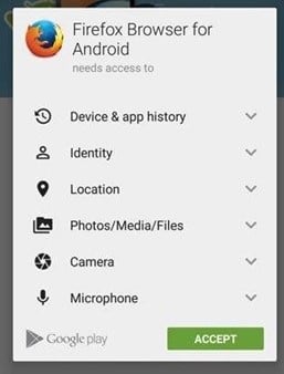
Example of group-all permission request[9]s9
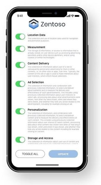
Example of group-all permission requests[10]
Permissions can be divided into: (i) critical permissions (those that relate to the core functionalities of the application); and (ii) secondary permissions (those that relate to additional functionalities of the application).[11]11
For example, a navigation app’s core functionality would be dependent on accessing location data. This would be a critical permission for it. However, a permission request to access the music app and library, to allow the user to see the details of the song playing while continuing to navigate the app, would constitute a secondary permission.
If a navigation app were to request permission to access the music library up-front, this would be outside the ambit of its core functionalities. Such a secondary request should be made with context and should remain optional, not affecting the app’s operation. Additionally, location data itself has varying levels of precision that can be employed, such as using it to approximate an area as a location as opposed to relying on the exact GPS co-ordinates.
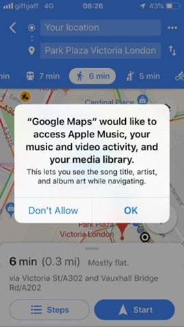
Example of a secondary permission request[12]12
Furthermore, for core and secondary functionalities, there may be intermediate levels of permissions, as in the screenshot below. Therefore, the user will be able to decide whether she wishes to deny permission or grant permission for one session or always while using the app.
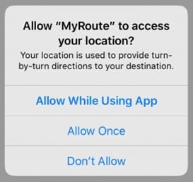
Example of intermediate levels of permission requests[13]
- Information in the request: A permission request for device data access should communicate the purpose for it to the user through its notice. The purpose string (technical term[14]) conveyed through customised text should make it easy for the user to understand and accept the request. This could even include an example of the functionalities such a request would This is key for secondary permission requests. This helps in communicating the value and benefit of granting a specific permission to the user.
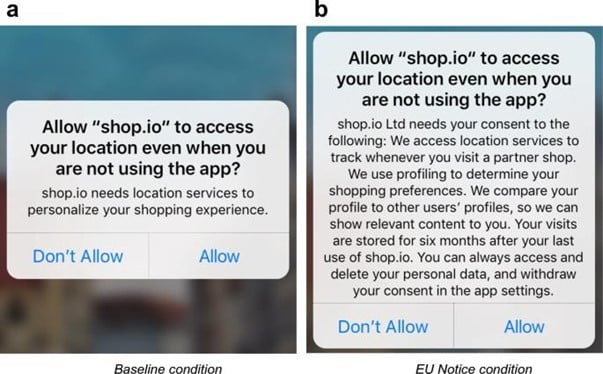
Example of a multi-screen short form privacy notice and permission request[15]
Periodic: Periodic notices can help with maintaining awareness of data collection practices. These can be used to remind users to review their privacy settings from time to time, thus evoking a sense of control and trust in them.
Example of a privacy reminder
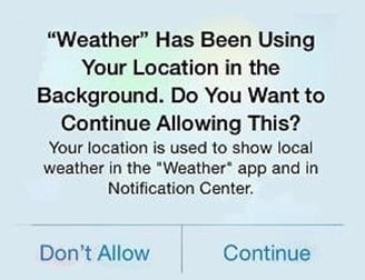
Example of a privacy reminder
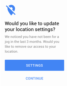
Example of a privacy reminder[16]
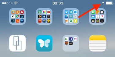
Persistent: Persistent notices can provide awareness of ongoing data practices in a less obtrusive manner. A persistent indicator is typically non-blocking and may be shown whenever a data practice is active. For example, by using special icons in a status bar or ambient sensors that light up when certain types of data are accessed. This is done in Android and iOS which display a small icon in the status bar whenever an application accesses the user’s location or camera light on a laptop device bar when an application is using the camera. However, an issue with such ambient indicators is that they can go unnoticed and most systems can only accommodate such indicators for a small number of data practices.[17]
Update to privacy policy: Users must be told about a material change to the way an application will collect or use their personal information, before such a change is implemented, so that they can make an informed choice about whether to continue to use the application. Consent to changes would depend on the type of change. For changes that are essential to an application’s continued operation, this would involve a notice that a change will occur and offer users a chance to disable the application if they do not wish to consent. For changes that are optional
for the user to adopt, this would involve a prompt with choices about whether to allow the change or continue with the previous functionality.
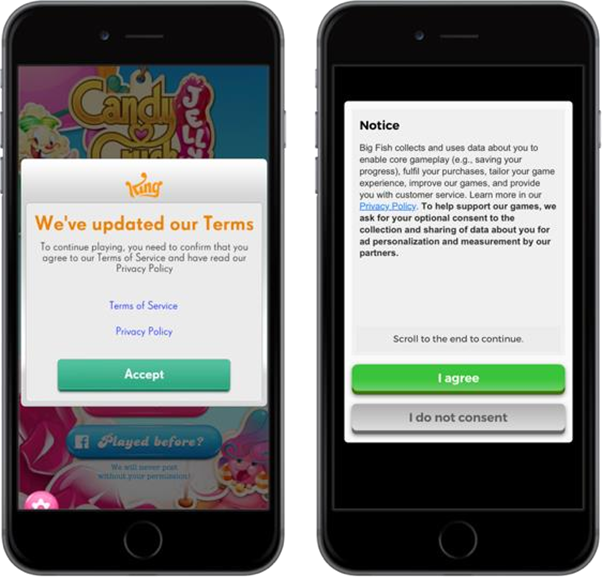
Example of privacy policy update[18]
Decision reversal: Whether a user grants or denies permission, it is important that the app communicates information regarding decision reversal. Especially in a scenario where the user attempts to use a functionality dependent on device data permission that was initially denied, the app should communicate how such decision can be reversed and the rationale behind it.
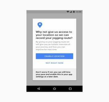
Example with decision reversal information[19]
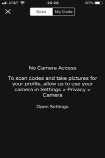
Example with decision reversal information[20]
[1] https://www.usenix.org/conference/soups2015/proceedings/presentation/schaub
[2] https://www.termsfeed.com/blog/sample-privacy-policy-template/
[3] https://twitter.com/en/privacy
[4] https://brianpagan.net/2018/privacy-a-quick-overview-for-app-designers/
[5] https://uxdesign.cc/what-does-gdpr-mean-for-ux-9b5ecbc51a43
[6] https://www.nngroup.com/articles/permission- requests/#:~:text=An%20app%20must%20request%20permission,to%20grant%20or%20decl ine%20access.
[7] https://www.leewayhertz.com/make-app-gdrp-compliance-ready/
[8] https://material.io/design/platform-guidance/android-permissions.html#usage
[9] https://www.smartlook.com/blog/the-best-way-to-get-user-consent-for-mobile-apps-in-2019/
[10] https://www.smartlook.com/blog/the-best-way-to-get-user-consent-for-mobile-apps-in-2019/
[11] https://www.nngroup.com/articles/permission- requests/#:~:text=An%20app%20must%20request%20permission,to%20grant%20or%20decline%20access.
[12] https://www.nngroup.com/articles/permission- requests/#:~:text=An%20app%20must%20request%20permission,to%20grant%20or%20decline%20access.
[13] https://developer.apple.com/documentation/uikit/protecting_the_user_s_privacy/requesting_access_to_protected_resources
[14] https://developer.apple.com/design/human-interface-guidelines/ios/app-architecture/requesting-permission/
[15] https://link.springer.com/article/10.1007/s12525-019-00332-3
[16] https://medium.com/@thelittlegyro/gdpr-from-a-ux-ui-designers-perspective-5fc797e45607
[17] https://www.usenix.org/system/files/conference/soups2015/soups15-paper-schaub.pdf
[18] https://gameanalytics.com/blog/gdpr-game-compliant.html
[19] https://medium.com/@thelittlegyro/gdpr-from-a-ux-ui-designers-perspective-5fc797e45607
[20] https://www.nngroup.com/articles/permission- requests/#:~:text=An%20app%20must%20request%20permission,to%20grant%20or%20decline%20access.